Menu Close

The Narrative of the 2018 Ontario Election: Regional Analysis

By Suhani Singh

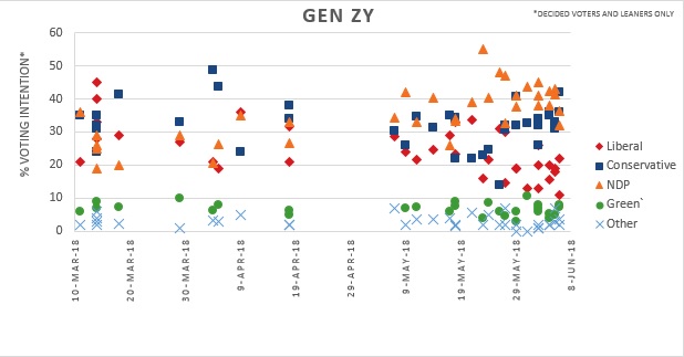
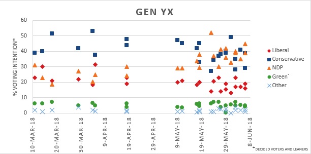
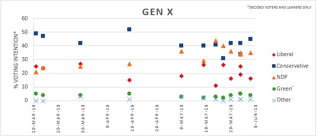
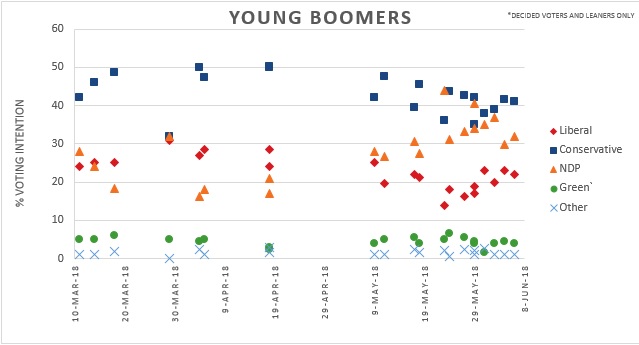
The previous three blogs in this four-part series have explored the voting intentions of Ontarians during the 2018 general election. The voting trends observed overall, in each gender, and each age group were discussed in the previous blogs. This blog examines regional voting preferences noting trends and differences. Polling data was categorized based of the common regional breakdowns including:

  • Toronto 416
  • Greater Toronto Area 905
  • Eastern Ontario
  • South Central Ontario
  • Southwestern Ontario
  • Northern Ontario

In order to determine the number of seats won by each party in a given region, the winners from each riding were added up based on CBC tracker results.

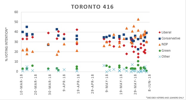
The Toronto 416 region represents the city core and close surrounding areas. The Conservatives polled between 35% – 45% during the pre-campaign period closely followed by the Liberals (30% – 40%) while the NDP remains low at around 20%. NDP support rose to 25-45% support during the campaign leading the Conservatives and NDP to be in a close race. Liberal party support significantly decreases over time falling between 15% – 30% before the election. This was a dramatic drop since the Liberals were polling similar to the Conservatives in the pre-campaign period.

In the 416 region, the PC and NDP tied winning in 11 seats each and the Liberal party claimed 3 seats.

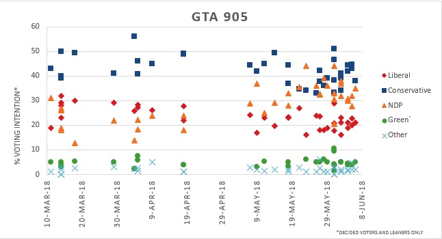
In the Greater Toronto Area 905 region, The Conservatives polled rather high (between 40% – 50%) during the pre-campaign period followed by the Liberals (at 20% – 30%) and the NDP (15%-25%). The NDP rose significantly during the campaign period to 25%-40% resulting in a close Conservatives and NDP race. Liberal support decreases over time dropping to 15% – 25% close to the election.

Though the polls show that the NDP gained significant support in the month of May, the Conservatives won a landslide in the 905 area taking 31 seats. The NDP won only 4 seats and the Liberals failed to win any seats despite consistent levels of support. These results reveal how the Ontario first-past-the post-election system can obscure significant support for parties in some areas.

In Eastern Ontario, Liberal support stayed stable between 20% – 30% support throughout the pre-campaign and campaign period. NDP support rose slightly from 15%-25% during the precampaign period to 20% – 35% closer to the election. The Conservatives remained on top throughout despite a falling from 40%-55% to 30-50% as the election approached.

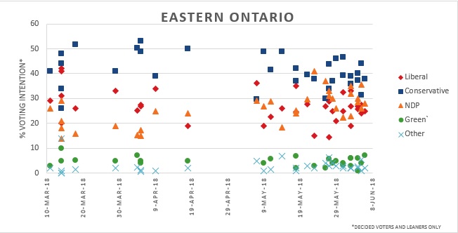
The Conservatives emerged as the winners of 14 seats, while the NDP won 2 and Liberals won 3.

In South Central Ontario, Conservative support had a slight fall over time but largely stayed on top of the other parties polling between 30 – 50% near the election. The NDP saw a significant growth in their supporters, starting from the 20% range and rising up to 30% – 55% toward the end.

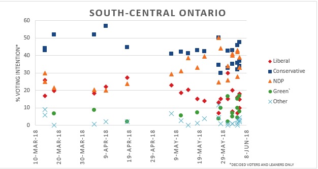
Polls indicated a tight race between The Conservatives and NDP as the election approached with the NDP eventually claiming victory in the region winning 7 seats while the Conservatives gained 4. Liberals saw a drop in their support (5% – 20%) over time polling similar to the Green Party and falling below the national average (15%-25). Neither party won any seats.

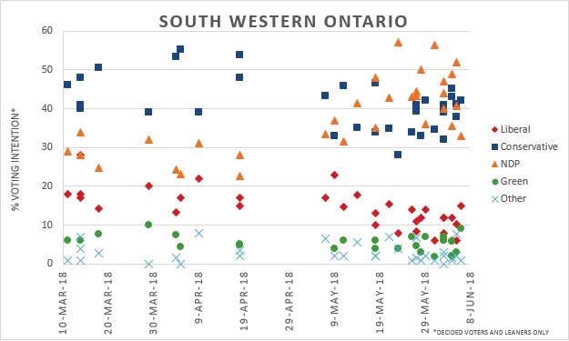
In South-western Ontario, Conservatives polling between 40% to 55% during the precampaign period but saw a drop to 30% – 45% closer to elections. The NDP went from 30% at the start to 40% – 55% closer to elections making it a close race between the two parties. Liberal support was low (15%-20%) to begin with and saw further drop to 5% – 15% over time. Green Party support was somewhat low (<10%) and stable in this region but the party saw won its first seat in Guelph. Liberals failed to win any. PCs won 12 and the NDP finished with 8.

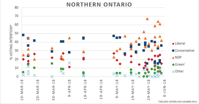
Conservatives and the NDP start polling similarly in Northern Ontario between 20% – 50% but the PCs saw a decline to 15% – 40% in late May while the NDP polled 30% – 60%. It should be noted the support range for individual parties was very large, likely due to this region having the smallest sample sizes. However, polls were relatively reflective of the results which saw the NDP win 8 seats and the PCs 4 seats. The Liberal Party saw some decline from 20% – 25% in precampaign period to 5% – 25% near the election They managed to win 1 seat in this region.

Overall, the PCs won 76 seats, NDP won 40, and the Green Party one 1. Liberals managed to win only 7 seats, one seat shy of maintaining their official party status. This Ontario 2018 elections blog series, looked at the different trends in voting intentions among Ontarians. Men and women presented difference in their choice of preferred party. Party choice also varied from region to region and from generation to generation.

The Narrative of the 2018 Ontario Election: Generation Gap

By Suhani Singh

Our first blog in this series looked at the overall polling trends during the last Ontario election and our last blog examined how party support differs among women and men during the Ontario election campaign. This blog will examine different age groups to see how they changed during the Ontario precampaign and campaign period for the 2018 election.

The age groups looked at are divided into five generations (Gen ZY, Gen YX, Gen X, Young Boomer, and Boomers). The table below shows who is included in these age groups. These age groups sometimes differed among polling firms which created some challenges for collecting data. The few adjustments that were made to the age groups for data collecting purposes are described below.

Age Group (yrs) Generation Name Modifications made
18-34 Gen ZY The data includes 18-29, 29-34 and <35 years groups
35-44 Gen YX The data includes 35-44, 35-49 and 30-44 groups
45-54 Gen X The data includes 45-54 and 45-59 groups
55-64 Young Boomers The data includes 50-64 and 55-64 groups
65+ Boomers & Greatest Generation The data includes 60+ and 65+ groups

Some polling firms divided the age groups as 18-34, 35-54, and 55+ years as oppose to the above-mentioned age groups. The age groups reported as 35-54, and 55+ were removed from our analysis and graphs because they will not give us true representation of our selected demographic due to the large age range that spans multiple generations. After removing unusable age data, each age group was plotted on a scatter graph to better compare how each generation changed over time, how they may differ from each other, and how they compare to the provincial average.

Conservative support among Gen ZY stayed rather consistent from the pre-campaign period up until the election at about 30% with few outliers. The NDP polled much lower during the pre-campaign period at 20% – 35%. The levels were similar to the Liberal Party, but unlike their counterparts, the NDP was able to rise significantly among young voters, polling between 30% – 50% throughout the campaign period. The Liberal Party saw their support drop over the four-month period, polling between 10% – 20% by the end of the campaign.

Gen YX party preference shows steady and consistent support for the Conservatives throughout the pre-campaign and campaign periods at close to 40%, only slightly dropping under 40% closer to the election. The NDP and Liberals started with similar support between 20% – 30%. Like other age groups and the provincial average, the NDP rose significantly by the end of the campaign period to 30% – 40% to create a close race with the Conservatives.

Gen X largely supported the Conservatives and maintained a steady voting preference at 40%. NDP support did increase over time from 25% to above 35%. Liberal support fell from 25% to some polls reaching under 20%. It is worth noting that Gen X contains a significantly smaller amount of polling data due to the limited number of polling firms that had a 45-54 or 45-59 category and the removal of the 34-54 age group. Although trends can be seen here, they should be taken with more caution.

The Conservatives had steady support from Young Boomers, polling slightly above the national average at 40%, which fell slightly to 35% in some polls during the campaign period. Support for the NDP grew over time leading the party to poll around 25% – 40% near the election. The Conservatives and NDP were close as the election approached but the Conservatives came out with higher support. Like with other groups, the Liberal Party remained below the PCs and NDP, polling between 15% – 25%.

The voting intentions among Boomers leaned towards the Conservatives at almost 50% in the precampaign period. As was seen provincially and among all other age groups, Conservative support dropped as the campaign period started and the election approached, falling to 35% – 45%. Conservative support among Boomers is still distinguishable from other age groups as the party was clearly ahead in the polls right before the election. Support for NDP increased during the campaigning to 30% – 40% from under 20% in precampaign period. However, this large increase was still not high enough to overtake the Conservatives.

Similar trends of high Conservative, competing NDP, and low Liberal support can be observed across all the age groups in this blog which is comparable to what was observed in the gender and province-wide demographics. The next blog will be the fourth and final blog in this series which will look at voter intentions in the different regions of Ontario.

The Narrative of the 2018 Ontario Election: Gender Preferences

By Suhani Singh

The previous blog in this series looked at how the provincial election became a tight race between PCs and NDP. The Conservatives generally topped the polls with the NDP following closely behind during the campaign period creating a neck and neck race in the polls closer to the election. The Liberals saw a significant drop in their popularity during the campaign period, polling significantly below the other two parties by election day. This blog will compare the average province-wide observations made in the previous blog to male and female voters.  

Looking only at the male voting preferences, the Conservatives emerge as the winner, significantly beating out the NDP and Liberals in almost all the polls. The PCs consistently polled higher among males with only a slight drop during the campaigning period. Despite the slight drop, the Conservatives still remained at between 40 to 50% support among male voters which is much higher than the overall provincial average. The NDP saw a considerable increase in support during the pre-campaign period that placed the party between 15 to 25% support to about 35% by the end of the campaign. The Liberal Party suffered a great loss of support from close to election, dropping below 20%. 

Looking at the female voting preference in the graph below, a trend different from the males is visible. The Conservative Party started strong in the female demographic polling close to 40% during the pre-campaign period but then sees a drop polling close to 30% during the campaign. The NDP began to rise above the Conservatives around this time placing them consistently in the top spot up until the election.

NDP support rose from approximately 25% to close to 40% near the election. Compared to the provincial average (30%-40%), the NDP placed higher among females. The Liberal Party also saw a decline in support closer to election, dropping from around 30% to slightly above 20%. Liberals still polled slightly higher among females than in males and the provincial average, but not enough to be a front runner in the election.

There was a clear distinction between male and female voting preferences. It is interesting to note that Conservatives started as the top choice for both genders early in the year but had a noticeable drop closer to election among female voters when the NDP gained significant support. The NDP saw this significant increase in their support after the first debate on May 7th. It can be surmised by this change in preferences that campaigning matters and can impact voting intentions. Because of these obvious differences observed among the gender demographics, we wanted to see if similar trends can be seen among different age groups. The next blog will explore these differences in a similar way by graphing and looking at trends between generations.