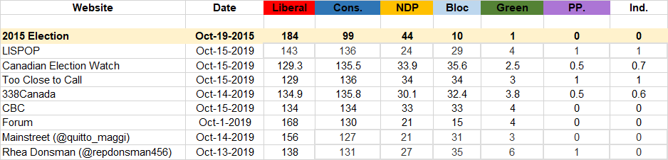
Poll aggregating websites and individual polling firms use various methods to project who will win the 2019 federal election. The following table presents a summary of the projections from a number of Canadian prognosticators from October 15th, 2019 (or earlier):
Liberal projections range from a high of 168 to a low of 125. (Note the 168 projection was projected from October 1st). Conservative support ranges from 127 to 150. All of these projections mean a minority government. Four of the nine projections predict the Liberals will have the most seats and five of nine projections predict the Conservatives will end up with the most seats.
The NDP projections range between a low of 24 and a high of 34 seats. The Bloc projections range between 15 and 36 seats. The Greens are projected between three and seven seats. Finally, the PPC is projected to win zero or one seat. Five of nine projections also predict an independent (presumably Jody Wilson Raybould).
It should be noted while these projections are the predictions published, many of the sites also put confidence intervals suggesting wider ranges of possible outcomes.
This is our first post summarizing election projections. If you know of a projection we missed please post it in the comments below or use the contact form to share it.
The results of this poll were based on an interactive voice response survey conducted Friday March 15thand Monday March 17th, 2019. A total of 1003 individuals completed the first question of the survey and 715 completed the entire survey. The survey was designed to aid in the development of the Region of Waterloo’s Strategic Plan for 2019-2023. The Strategic Plan helps Council and staff set priorities and achieve goals, all while keeping the community’s concerns and suggestions in mind. A significant proportion of the Strategic Plan includes hearing input from the public and listening to comments, concerns, etc. so that the Region can set appropriate priorities. The questions in the survey are also aimed to help the Region of Waterloo during the drafting of its Strategic Plan in the future.
The Strategic Plan has 5 focus areas: Thriving Economy, Sustainable Transportation, Environment and Sustainable Growth, Healthy, Safe, and Inclusive Communities, and Responsive and Engaging Government Services. The questions that were administered as a part of this survey were developed by ensuring that these focus areas were kept in mind.
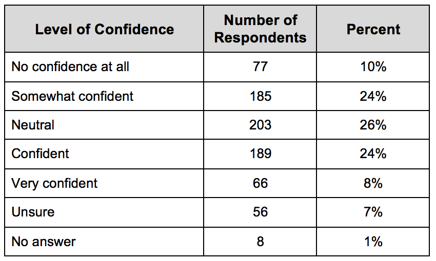
The first question on the survey asked participants about the level of confidence they have in their local government. The results are shown in the chart below, indicating that a majority of citizens (56%) are confident in the regional government to some degree (including somewhat confident, confident, and very confident levels).
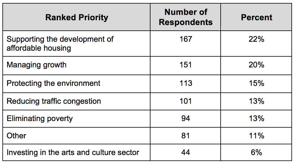
The survey was a way to analyze the top priorities that need to be set by the Region of Waterloo for the development of their Strategic Plan. Respondents were asked what they think the biggest priority in Waterloo Region is that the regional government should address. The results, as shown in the chart below, have been ranked based on the number of respondents choosing a given category as their top priority. The top 3 priorities are: 1) Supporting the development of affordable housing 2) Managing growth, 3) Protecting the environment.
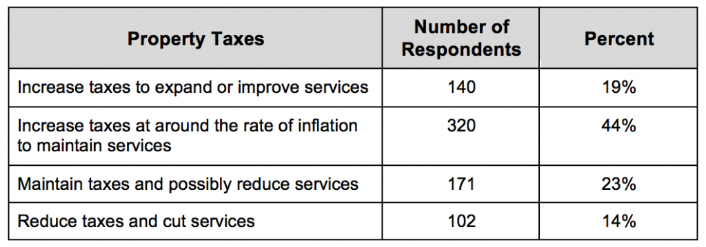
A significant component of the Strategic Plan focuses on the services that are delivered by the Region of Waterloo, such as public transportation, waste collection, and so forth. In order to better understand the preferences among citizens living in the Region of Waterloo in relation to the delivery of services, the survey asked: “Regional Government must balance the cost of delivering services with taxation. Which of the following would you most prefer for property taxes in Waterloo Region?”
Results indicated that 19% preferred increasing taxes to improve services while 14% preferred having property taxes decreased. 23% preferred keeping taxes that same and possibly reducing services. The largest proportion (44%) preferred having taxes increased with the rate of inflation and maintaining current services.
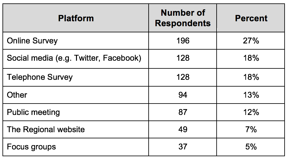
This survey was also used to analyze the best ways and platforms to receive public input in the future. Respondents were asked, “If the Region of Waterloo wanted to gather public input or engage you on major issues or decisions, what are the best ways?” It was found that the best ways to gather public input or engage on major issues/decisions in the region are: 1) Online Survey, 2) Social Media, and 3) Telephone Survey. All other options that were included in the survey are listed below.
Ultimately, the survey helped to provide the Region of Waterloo with important information that can be used during the development of the 2019-2023 Strategic Plan. A total of 9 questions were administered, yet the responses that have been analyzed above highlight the most critical results that will be taken into consideration by the Region.
…
Survey Details
The Interactive Voice Response (IVR) survey was conducted by Laura Krizan; Abby Schlueter; Andrea Volford, and Professor Anthony Piscitelli on March 15th and March 17th, 2019. Throughout the development of the survey, the students worked alongside Lorie Fioze, Manager of Strategic Planning and Strategic Initiatives. The questions that were formulated for the survey focused on supporting the development of the Region of Waterloo’s strategic plan. The survey was funded by the Region of Waterloo to support this initiative.
Sampling Approach
The sample size was created by randomly selecting Waterloo Region landlines listed in a digital phone book. A sample of likely cellphone numbers was added by randomly selecting phone numbers that were originally assigned to Waterloo Region, according to the Canadian Numbering Administrator. Sampling errors exists as a result of this approach due to the mismatch created by the random dialling of phone numbers as opposed to randomly sampling actual Waterloo Region residents.
Response rate
The survey called 46,912 live lines. The response rate was 1.5%, which is based on 715 respondents who completed the entire survey. All 788 respondents who answered the first three questions were included in the results. It is worth noting that 215 (21%) respondents were not eligible to participate due to being under 18 or not living in Waterloo Region.
Weights
Results of this survey have been weighted by age, gender, and city/township according to the 2016 census. The full weights are posted along with the raw data on OpenIcpsr.org and can be found by visiting: http://doi.org/10.3886/E110225V1
Margin of Error
Results are considered accurate +/-3.7%, 19 times out of 20. The margin of error on subsamples is higher.
The survey results will exhibit sampling error as a result of the mismatch created by the random dialling of phone numbers as opposed to randomly sampling actual Waterloo Region residents. This survey was approved by the Conestoga College Research Ethics Board.
The previous Wcalc blog discussed the
results generated from compiled federal polling data from November 7, 2015 to
May 4, 2019. We discovered that our results were not consistent with other
polling trackers in terms of calculating popular support percentage for the
People’s Party of Canada and “Other Party” support which were overestimated. However,
it did a satisfactory job in estimating Liberal, Conservative, NDP, Bloc, and
Green Party Support. Since the federal polling data is just an estimate at this
time with no election results to compare to, we wanted to test Wcalc once more
with 2018 Ontario election polling data before we completely disregarded the Wcalc
program for our polling calculation purposes.
We ran the overall Ontario polling data
collected from March 11 to June 6 through Wcalc. The goal was to compare the
Wcalc results to the real election results to test the programs ability to
model changes in public opinion toward provincial parties over a short period
of time. The expectation was that Wcalc would create a clearer picture of
election results, as it proved successful at predicting the 2015
federal election results.
For the purposes of running the data in Wcalc,
we removed the Green Party and “other party” polling data from Ipsos and Leger
because the Green Party was not asked as a separate answer for respondents, thus
inflating the “other party” category and giving us no Green Party data.
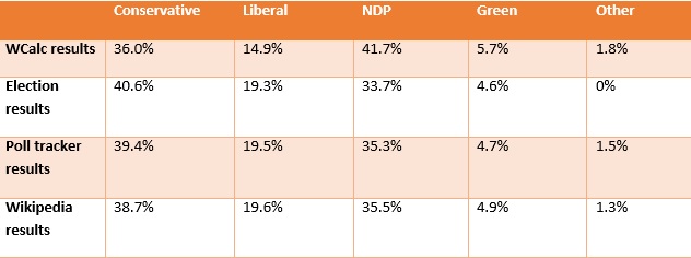
The
table below compares the actual percentages of the popular vote from the 53rd
Ontario general election with Wcalc the final predicted results based on
compiled polling data. It is clear that the Wcalc results were significantly
different from the election results.
Party
Election results
Wcalc results
Conservatives
40.6%
36%
Liberal
19.3%
14.9%
NDP
33.7%
41.7%
Green Party
4.6%
5.7%
The Conservatives and NDP had the most
shocking results as their numbers were far from reality and seem like they
should be switched with one another. The Conservatives were off by 4.6% scoring
less than what they actually received in the election while NDP support was
inflated by 8% in Wcalc from the real numbers. Had these results from Wcalc
been released before the election to predict the outcome, it would have wrongly
predicted an NDP victory.
Comparing our predictions to CBC Poll
Tracker and Wikipedia, we can see how different and skewed the Wcalc results
are when predicting election results based off of poll averages. The two other
predictions were much closer to the actual results of the popular vote as
indicated in the chart below.
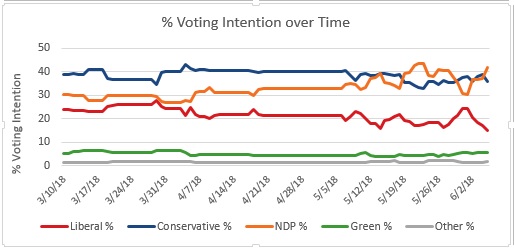
The time series generated by Wcalc is shown
in the graph below. It is evident from the graph that the NDP takes a bit of a
jump during the campaign period, followed by a slight drop, and then emerges on
the top with 41.7%. Conservative support declined a little and then gradually
increase to 36%. The prediction for Liberal Party was 4.4% lower than the
actual results and 1.09% higher for the Green Party. The Green Party difference
was not significant and fell within a +/-1% margin of error.
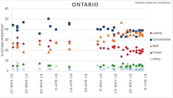
The scatter plot graph for Ontario shows a neck to neck race between the Conservatives and the NDP. Conservatives can be seen polling close to 40% with NDP just slightly under. Wikipedia’s graphical analysis predicted results closer to actual election results with a margin of only +/-2%. Wikipedia used local regressions for smoothing the data, therefore, projecting results closer to the actual election results.
The data from WCalc did not match the
election result for PC and NDP. The Dyad Ratio Algorithm that Wcalc is based on
overestimated the trend of NDP support and while underestimating PC support.
These results were disappointing and have
caused ThreeHundrededandThirtyEight.com to reconsider the use of Wcalc for
predicting elections. While the research
evidence suggests Wcalc is effective at modeling policy mood, we
will no longer be using it to predict election results.