
By Suhani Singh
The previous Wcalc blog discussed the results generated from compiled federal polling data from November 7, 2015 to May 4, 2019. We discovered that our results were not consistent with other polling trackers in terms of calculating popular support percentage for the People’s Party of Canada and “Other Party” support which were overestimated. However, it did a satisfactory job in estimating Liberal, Conservative, NDP, Bloc, and Green Party Support. Since the federal polling data is just an estimate at this time with no election results to compare to, we wanted to test Wcalc once more with 2018 Ontario election polling data before we completely disregarded the Wcalc program for our polling calculation purposes.
We ran the overall Ontario polling data collected from March 11 to June 6 through Wcalc. The goal was to compare the Wcalc results to the real election results to test the programs ability to model changes in public opinion toward provincial parties over a short period of time. The expectation was that Wcalc would create a clearer picture of election results, as it proved successful at predicting the 2015 federal election results.
For the purposes of running the data in Wcalc, we removed the Green Party and “other party” polling data from Ipsos and Leger because the Green Party was not asked as a separate answer for respondents, thus inflating the “other party” category and giving us no Green Party data.
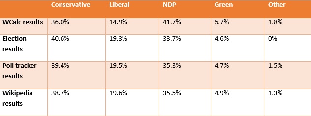
The table below compares the actual percentages of the popular vote from the 53rd Ontario general election with Wcalc the final predicted results based on compiled polling data. It is clear that the Wcalc results were significantly different from the election results.
| Party | Election results | Wcalc results |
| Conservatives | 40.6% | 36% |
| Liberal | 19.3% | 14.9% |
| NDP | 33.7% | 41.7% |
| Green Party | 4.6% | 5.7% |
The Conservatives and NDP had the most shocking results as their numbers were far from reality and seem like they should be switched with one another. The Conservatives were off by 4.6% scoring less than what they actually received in the election while NDP support was inflated by 8% in Wcalc from the real numbers. Had these results from Wcalc been released before the election to predict the outcome, it would have wrongly predicted an NDP victory.
Comparing our predictions to CBC Poll Tracker and Wikipedia, we can see how different and skewed the Wcalc results are when predicting election results based off of poll averages. The two other predictions were much closer to the actual results of the popular vote as indicated in the chart below.
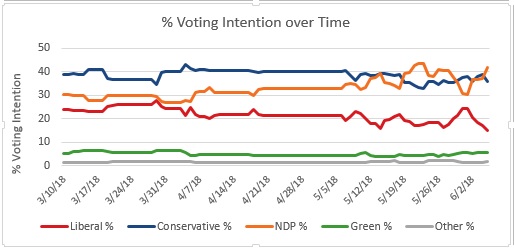
The time series generated by Wcalc is shown in the graph below. It is evident from the graph that the NDP takes a bit of a jump during the campaign period, followed by a slight drop, and then emerges on the top with 41.7%. Conservative support declined a little and then gradually increase to 36%. The prediction for Liberal Party was 4.4% lower than the actual results and 1.09% higher for the Green Party. The Green Party difference was not significant and fell within a +/-1% margin of error.
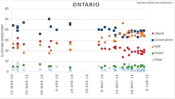
The scatter plot graph for Ontario shows a neck to neck race between the Conservatives and the NDP. Conservatives can be seen polling close to 40% with NDP just slightly under. Wikipedia’s graphical analysis predicted results closer to actual election results with a margin of only +/-2%. Wikipedia used local regressions for smoothing the data, therefore, projecting results closer to the actual election results.
The data from WCalc did not match the election result for PC and NDP. The Dyad Ratio Algorithm that Wcalc is based on overestimated the trend of NDP support and while underestimating PC support.
These results were disappointing and have caused ThreeHundrededandThirtyEight.com to reconsider the use of Wcalc for predicting elections. While the research evidence suggests Wcalc is effective at modeling policy mood, we will no longer be using it to predict election results.