Menu Close

The Accuracy of the Dyad Ratio Algorithm and the 2015 Federal Election

The Dyad Ratio Algorithm, as explained in the previous post, can be used to estimate public opinion towards issues or support for political parties. This approach does not weight the polling firms on their accuracy or their potential bias instead all surveys are assumed to be equally valid, with the only variance in importance of a poll for the model based on the survey sample size. This is contrast to Éric Grenier’s approach at CBC and Nate Silver’s approach at fivethirtyeight.com.

Grenier at CBC weights the results by sample size, time of the poll, and firm accuracy. Polling firm accuracy is determined by the firm’s last survey before an election compared to the election result for each election polled over the past ten years. A survey’s impact diminishes by 35% for each day of an election. Silver at fivethirtyeight.com also uses accuracy of the polling firm and a measure for house effects which is built into the model itself. Silve’s approach also uses sample size to weight the impact.


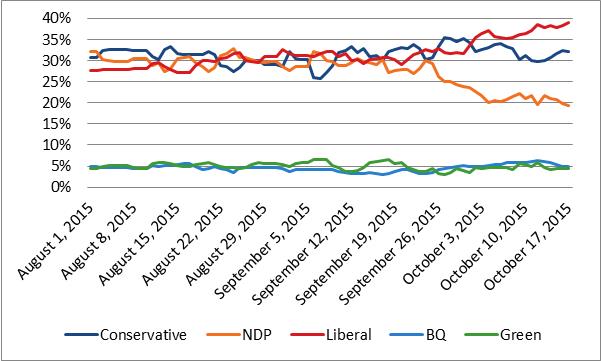
ThreeHundredThirtyEight.com at this time does not have a record of the accuracy of polling firms, as such the approach used here accounts for each poll equally in the results. When examining the 2015 federal election the  model’s approach performed quite well at predicting party support.

Comparing the projections from the Dyad Ratio Algorithm using Wcalc to the election results each outcome is within 1.1 percentages points of the final results. (Note the election results were re-calculated to remove those who voted for an ‘other’ party). The Conservatives are projected exactly, Bloc within 0.2 percentage points, the NDP are within 0.5 percentage points, the Liberals within 0.8 percentage points and the Greens within 1.1 percentage points.

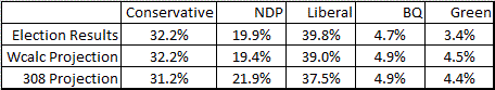
The results of the Dyad Ratio Algorithm also outperformed the projection from Éric Grenier narrowly. Grenier has the Conservatives within 1 percentage point, Bloc within 0.2 percentage points, the NDP are within 2 percentage points, the Liberals within 2.3 percentage points and the Greens within 1 percentage point. Though it is worth noting that Grenier’s projections were able to include ‘other’, which he projected to yield 0.9% support compared to the 0.8% they actually received. Also, in fairness, the Dyad Ratio Algorithm projections are being made after the fact and Grenier’s were made in real time before the election results were known. To put it another way, if these results had shown ThreeHundredThirtyEight.com to do significantly worse this model would have been re-examined.

The next step is to begin testing the model to predict support during elections. Future posts will use data from Wikipedia to show how the Dyad Ratio Algorithm is projecting support for the federal parties on an on-going basis.

Party Support in the 2015 Federal Election

As promised in my first post, this post uses the 2015 federal election to show how ThreeHundredThirtyEight.com will track support for political parties over time use the Dyad Ratio Algorithm as calculated using Wcalc by James Stimson.

Essentially this algorithm uses the differences between polls and their sample sizes to show the varying level of support for issues or parties over time. When the timing of polls overlap this gives the ratio an opportunity to evaluate how they compare to one another. The multiple polls that are inputted into the program then are combined to create a trend line show changes in support over time. One important note with this approach, for a result to appear in the calculation the polling firm needs to ask the question at least twice (and the more times the better).


Before demonstrating the approach a few other caveats should be covered. Wcalc offers a smoothing option, which is used in this analysis. The smoothing effect assumes that changes in opinion are generally gradual and that abrupt changes may be the result of sampling error. Smoothing has a particularly large impact at times when there are only a few polls and typically less of an impact when there are many polls in a given time period.

Secondly, since the Dyad Ratio Algorithm is used to estimate support for each political party individually the total support levels at any one point in time does not always add up to exactly 100%. When this occurs the data has been reweighted so the total support for each political party always equals 100%.

When the Dyad Ratio Algorithm estimates each party’s level of support during the 2015 federal election the results can be graphed to show the changes over time. The resulting graph shows the levels of support for the NDP fall dramatically starting in late September and the Liberal party rising mostly steady throughout the campaign.

The previous graph was created using data from the Wikipedia page Opinion polling in the Canadian federal election, 2015. This Wikipedia page also graphs the data thanks to the work of Galneweinhaw. The Wikipedia graph is created by using Local Regressions; they also add confidence intervals in grey at the 95% level.

Opinion Polling during the 2015 Canadian Federal Election

The noticeable difference between the approaches is the additional smoothing in the Wikipedia approach. Here the NDP trendline is much clearer in its direction from the start of the campaign to the end. While this is a valuable approach for avoiding the impact of outlier polls, the additional smoothing may be less likely to pick up a shift in support, instead assuming a high or low poll is simply an outlier.

Indeed, both approaches have value when interpreting an election. ThreeHundredThirtyEight.com will use the Dyad Ratio Algorithm to provide observers with more information about the election. In addition, the Dyad Ratio Algorithm is much more valuable when estimating changes in public opinion over time, as these changes are based on significantly less polling data.

In the next post how the Dyad Ratio Algorithm performed at predicting the final vote totals for each political party in the 2015 election will be explored. If you would like to work with this dataset yourself the raw data is available at http://doi.org/10.3886/E107121V1

Comparing the Regional Chair Survey to the Election Results

From October 16 to 17, 2018, ThreeHundredThirtyEight.com conducted a survey to assess support for the candidates in the Waterloo Region Chair race. The results showed Karen Redman in the lead but a large number of voters undecided. Ultimately, Karen Redman was successful during the election held from October 22 to 23, 2018. This post looks back to assess how accurate the survey was at predicting the election results.

In the original reporting of the race, we reported a margin of error of +/-4.25%. For simplicity sake, when reporting a margin of error a single value is typically shared. However, the calculation for margin of error actually varies based on the observed proportion. Results close to 50% have higher margins of error than results close to 10%. Forum Research breaks down the rough margins in a handy table by sample size and observed proportions. For example, according to Forum Research’s table, with a sample size of 300, the margin of error can vary between 3.4% (at 10% or 90% proportion) and 5.7% (at a 50% proportion).

In this post, one margin of error per sample is reported calculated at the 95% level (i.e. the results are considered accurate 19 times out of 20). However, in the commentary assessing the accuracy of the results the margin of error for the individual proportions were calculated using an online calculator.

The obvious place to start is to assess the accuracy of the top line results as reported on October 18, 2018. Here we see that the results overall did quite well. The results of each candidate are within the margin of error except for Jan d’Ailly who slightly outperformed. His margin of error was 2.8 percentage points, yet he received 9.7% of the vote, a result 3.0 percentage points above his 6.7% predicted support. The tracking error on this model also performed quite well at 8.4 percentage points. The tracking error was calculated by taking the election results and subtracting them from the survey results, then adding the absolute value of each of these numbers.

The reported results included leaning and decided voters. It is also possible to compare only using decided voters.  Once again in this approach, all results except for those involving Jan d’Ailly are within the margin of error. However, in this model, the tracking error increases to 11.2 percentage points.

A model was also created to predict likely voters. In this model, the results do not work as well. Both Karen Redman and Jan d’Ailly are outside of the margin of error in this model and the tracking error increases to 15.3 percentage points. Interestingly, using only unlikely voters all candidates results are within the margin of error. The small sample size for this group increases the margin of error. The tracking error amongst unlikely voters is 13.1 percentage points.

When the results of leaning and likely voters are broken down by city/township they all fall within the margin of error. However, it should be noted some of these sample sizes are very small creating very large margins of error. It is worth noting with respect to Karen Redman, the Cambridge results were at the edge of the Margin of Error at the 95% level.

The tracking error was lowest in the townships at 2.7 percentage points, followed by Kitchener at 5.9 percentage points, then Waterloo at 9.3 percentage points, and then Cambridge at 18.5 percentage points.

One final comparison was made. The results reported publically were weighted by age, gender, and city/township of residence. However, it is also possible to compare the unweighted survey results to the actual election results. This approach finds all of the results well within the margin of error and a tracking error of 4.8.

Overall the results of the survey were a fairly good predictor of the actual election results. Indeed, even the breakdown by city/township showed results that were a reasonable predictor of the actual election results. However, the likely voter model was a poor predictor of the election results. It is fortunate this model was not used. It is also interesting to note that weighting the variables did not improve the predictive power of the survey.